04
Colour
Colour adds impact, excitement, and delight to any identity system. We leverage color to set ourselves apart in the market, enhance our content, and guide our users effectively through our communications.
The Basics
Our colour palette features vibrant, digitally-native hues complemented by a refined selection of greys and neutrals.
Colour values
HEX
A hexadecimal way of representing the red, green and blue of screen colours.
RGB
Red, green and blue, the component colours which create all screen colours.
CMYK
Cyan, magenta, yellow and black. The four colours used in offset and digital printing.
PMS
Pantone Matching System: Global colour numbering for precise colour selection and matching.
Various factors can affect colour reproduction. Prior to large-scale print runs, it's advisable to conduct testing.
Cognism Colours
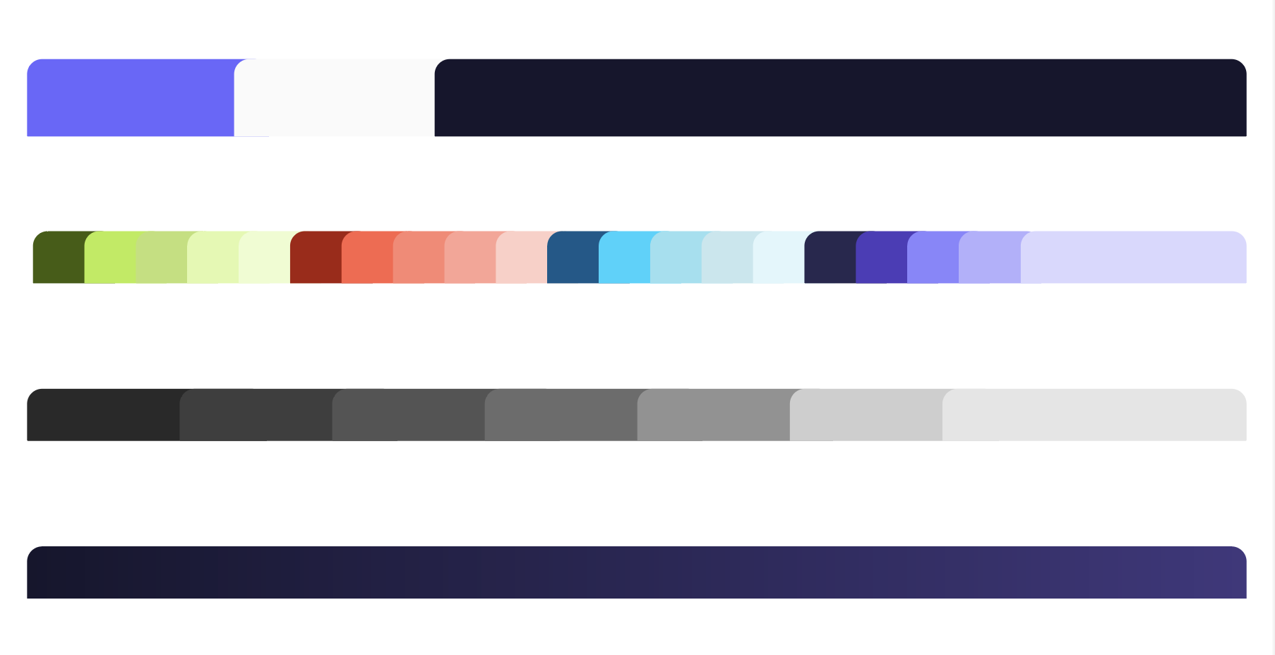
Primary Colours
Accents:
Gradients:
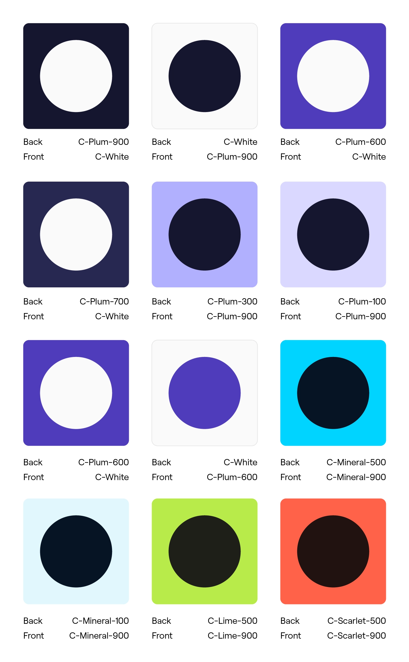
Colour Pairings
Pairings to use
Text should always be easy to read. These pairings strike the right balance between clarity and contrast, while letting our vibrant shapes do the talking. Stick to primary colours for text and use accent colours subtly, so the overall design remains clean and accessible.
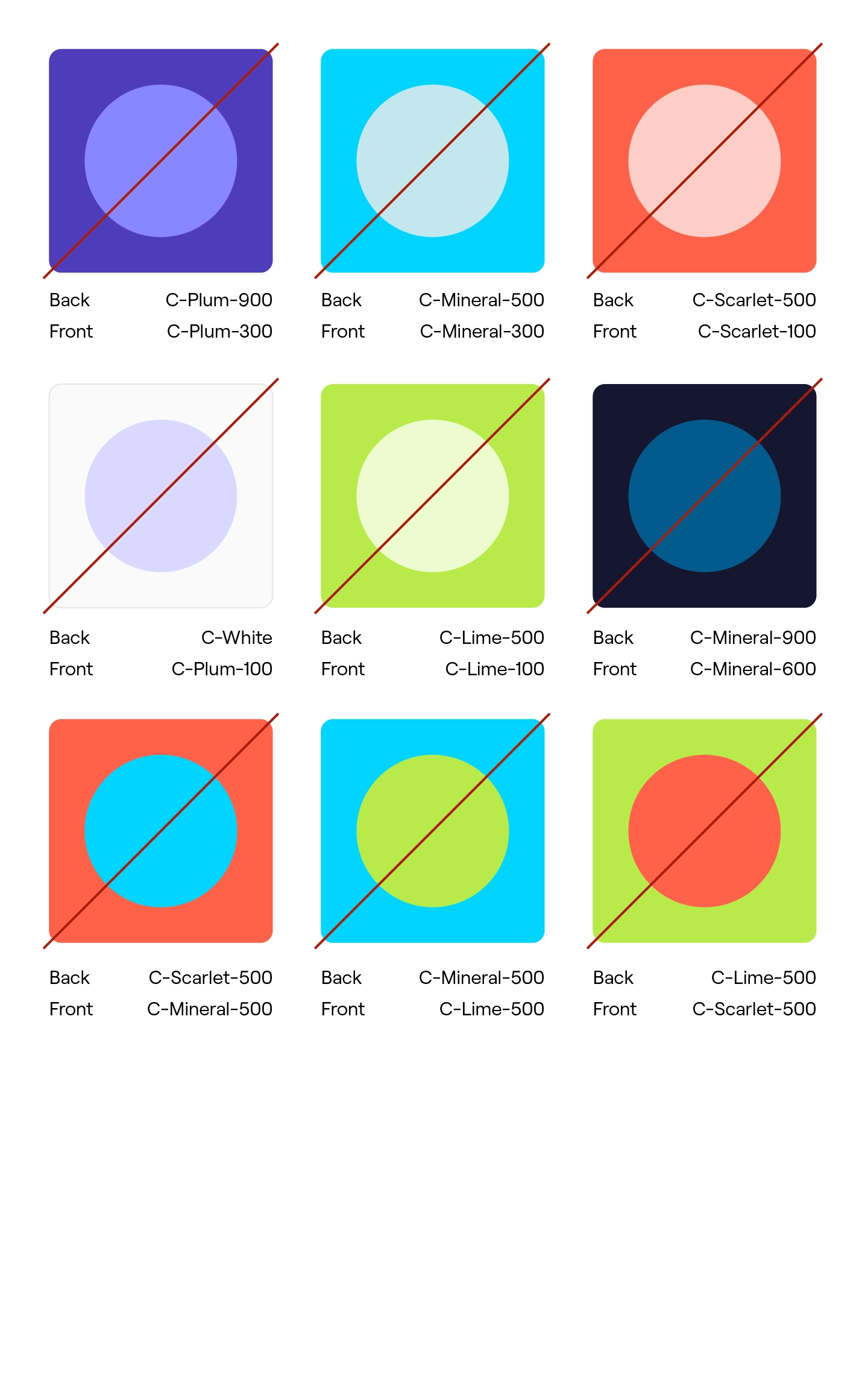
Pairings to avoid
Some colour combos just don’t work—especially when text sits on top. These pairings lack contrast and make content harder to read, distracting from our bold brand visuals.Avoid using these in layouts to keep designs accessible and impactful.