02
Logo
The Cognism logo embodies trust, quality, and serves as a vital identifier for our clients. To maintain its integrity across diverse platforms, we provide clear guidelines for consistent and precise usage, reinforcing our commitment to clarity and coherence.
Lookup
The Cognism logo encapsulates our brand essence, acting as a succinct and memorable symbol that resonates across diverse scales and mediums.


Safe zones & minimum sizing
The exclusion zone safeguards the legibility and impact of the logo by isolating it from other visual elements like text, graphics, and imagery.
The safe zone for the icon when used in isolation equals the width of the small circle within the logo.
The safe zone for the wordmark equals the width of the 'c' within the logo.

The safe zone for the full logo equals the width of the 'c' within the logo.
Minimum sizing - print
minimum size should never be less than 30mm
Minimum sizing - digital
minimum size should never be less than 100px
The minimum siziing guidelines must be adheared to to maintain visibility
Colour
Understanding these colour choices empowers you to effectively represent Cognism across various mediums while staying true to our brand's identity.

Misuses
To maintain the integrity and recognition of our brand, it’s essential that the logo is used consistently and correctly. Any alterations, distortions, or unauthorised applications can dilute our visual identity and confuse our audience.
Don't
Change the colour of the logo lock-up neither the symbol nor the wordmark
Don't
Add effects on the logo, such as drop shadows, bevels or blurs
Don't
Rotate, distort or skew the proportions of the log
Don't
Outline the logo
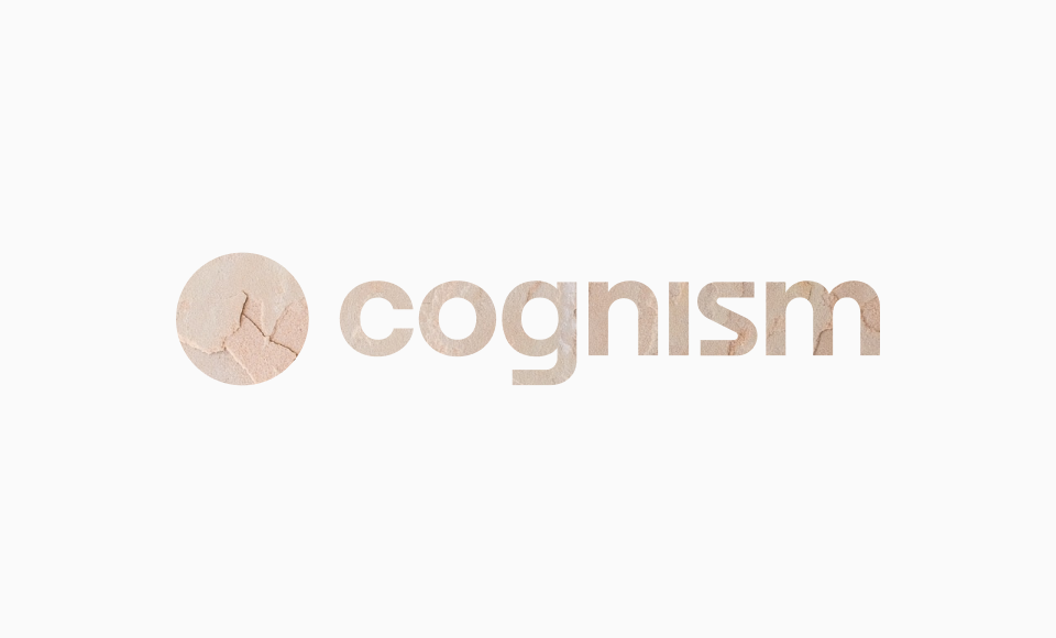
Don't
Fill the logo with an image or texture
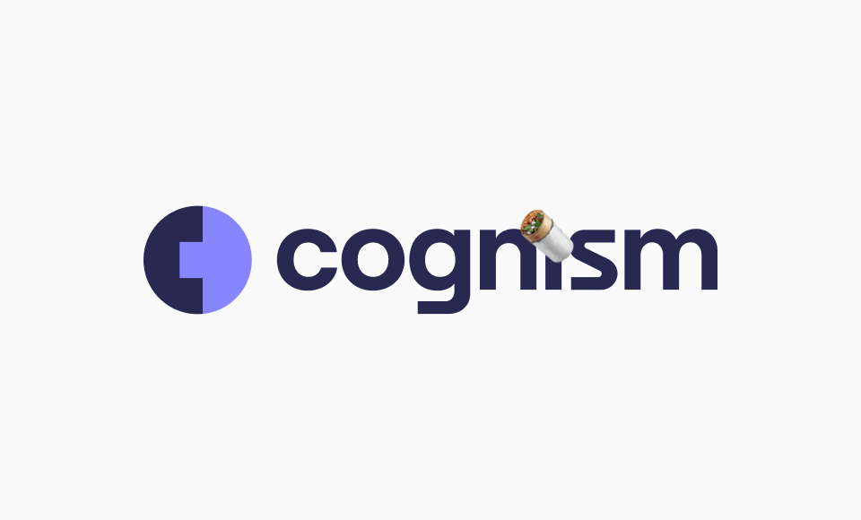
Don't
Add images or decorative elements to the logo